Romain Lacourbas ASC AFC & Vincent Gallot AFC: The cinematography of Néro the Assassin
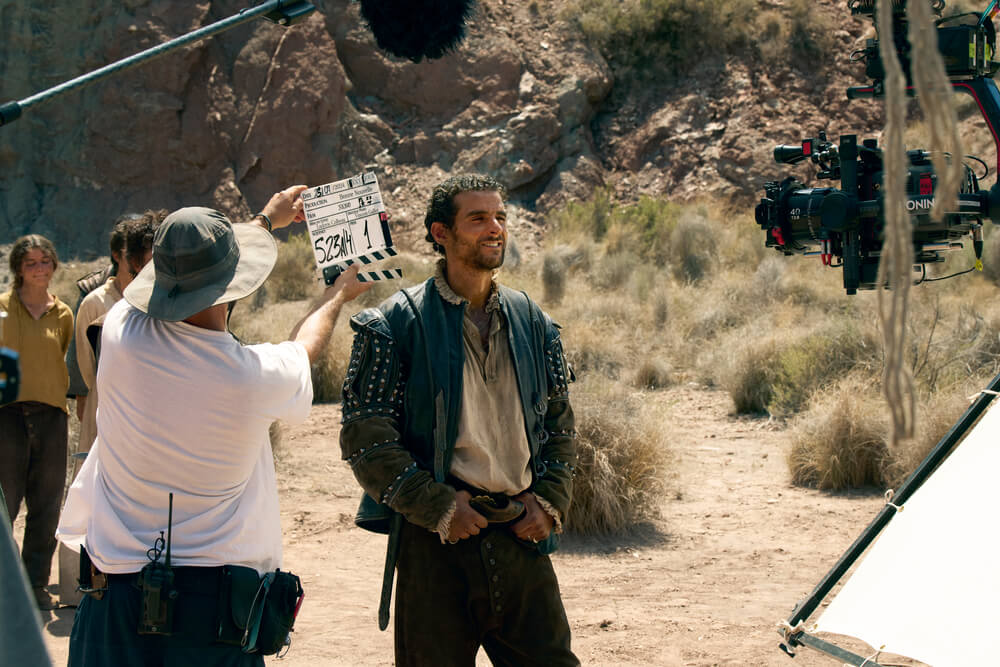
Now streaming on Netflix, the series Néro the Assassin transports viewers to France in the year 1504, when the eponymous antihero (played by Pio Marmaï) embarks on an epic journey to save his estranged daughter, Perla (Lili-Rose Carlier Taboury). The production was divided into two blocks, with co-creator Allan Mauduit directing the first four episodes in collaboration with cinematographer Romain Lacourbas ASC AFC; the second block was then directed by Ludovic Colbeau-Justin, who partnered with cinematographer Vincent Gallot AFC. Panavision recently caught up with the two cinematographers for a conversation about their collaboration and how they crafted the show’s widescreen imagery with Ultra Panatar II 1.3x anamorphic lenses and Sony Venice 2 cameras sourced through Panavision Paris.
Panavision: How did each of you become involved in the project?
Romain Lacourbas ASC AFC: Allan Mauduit was looking for a director of photography for the project. The scripts for the first episodes were sent to me, and I was immediately captivated by the story. I instantly loved the offbeat tone, this unusual world with its desire to blend genres. I already really liked Allan's films and appreciated his directing style. We met, and he offered me the job a little while later, much to my delight.
Vincent Gallot AFC: I met Ludovic Colbeau-Justin over coffee because he was looking to meet directors of photography. He had told me about his projects but hadn't directly offered me the chance to work on Néro with him. Afterwards, we kept in touch, and just as I was learning about the imminent cancellation of a project I'd embarked on, by happy coincidence, he asked me if I'd be willing to join him on this adventure. I read the episodes in one evening at the hotel, watched some rushes from the shoot, and was more than thrilled. The scripts were very appealing, and above all, the visuals immediately captivated me and gave me the impression that something special was happening. I was very enthusiastic about Romain and Allan's choices; it was quite a challenge to maintain that level of quality in Block 2 with Ludovic.

How would you describe the look of the series?
Romain Lacourbas: From the very beginning of our discussions, Allan Mauduit regularly referred to Westerns to describe the overall visual atmosphere he wanted to create. So I initially gravitated toward this genre, trying to revisit it, exploring how to modernize it, while of course emphasizing the aridness, which is the context and practically a character in its own right.
But it's also a road movie, with characters embarking on a long journey from Lamartine to Ségur. It was therefore essential to convey a sense of progression, but also to clearly separate these two places visually: Lamartine and its vibrant world, its bright colors, its asymmetrical and unstructured architecture, the city of the people; Ségur, the city of the powerful surrounded by the destitute, grayer, more austere, with more symmetrical compositions. There are thus two distinct and contrasting looks, between which landscapes of burnt forests and hostile, desert-like zones alternate.
Vincent Gallot: For my part, I had to follow the path laid out by Romain. The project's art direction was already well established; I was following in my predecessor's footsteps. I worked extensively with the documents Romain sent me, as well as those from production designer Pierre Quéfféléan.
In the series presentation document, there was a quote from Romain saying that we shouldn't ‘have a system.’ That allowed me to loosen up a bit. Ludovic and I stuck as closely as possible to the style of Block 1 and had a lot of freedom in our set design choices. I worked with the LUTs Romain had prepared, only changing the saturation outdoors. As we approached the town of Ségur, we needed to feel the dryness and intensity of the sun even more strongly, as well as the harshness of this austere capital.
It was important to convey a certain discomfort in the slums, with sharp, almost piercing whites at times, even turning our backs to the sun occasionally to experience an overwhelming sensation. Even though I find backlighting more beautiful, this stylistic choice was essential in my opinion. Mixed with the grime and sweat, I think it helped to make this unusual setting more believable.

Were there any particular visual references that inspired you as you prepared for principal photography?
Romain Lacourbas: Since our starting point was a ‘modern western,’ I naturally rewatched some Sergio Leone films. Most of the time we had at least four characters in the frame, in vast landscapes, so the widescreen 2.39 aspect ratio was the obvious choice. We also decided to sometimes use a very deep depth of field for certain dialogue scenes involving several characters, in the style of Leone's iconic shots in Once Upon a Time in the West and The Good, the Bad and the Ugly, so we sometimes shot T11 or T16. This allowed for a minimalist approach to editing, favoring a strong composition where the characters are sometimes almost all facing the camera, but where the viewer can choose who to look at since everyone is in focus.
In Leone's films, you also feel the intensity of the heat. Makeup plays a crucial role in reinforcing this feeling — and I commend the remarkable work of makeup artist Laura Ozier and her team — and the choice of color palette also contributes. [Cinematographer] Tonino Delli Colli [AIC] defined the palette of Sergio Leone's Westerns as ‘necessarily’ reduced to reds, beiges, and browns. In our desire for ‘modernization,’ it seemed interesting to start with this idea, adding touches of cool colors to enhance the warm tones by comparison. Since these blues and greens are also present in the sets and costumes, I worked on a LUT reinforcing this idea very early in preproduction, with the invaluable help of color scientist Florine Bel, colorist Magalie Léonard and DIT Brice Barbier.
Vincent Gallot: I stayed within the artistic continuity established by Romain. Perhaps a few paintings by Henri Fantin-Latour and Rembrandt for the interiors, but these are fairly common references to all directors of photography when discussing black on screen.

In capturing the widescreen aspect ratio, what specifically led you to embrace the anamorphic format?
Romain Lacourbas: The choice of anamorphic lenses was immediately obvious to Allan and me, unlike the Westerns we often referenced, since those were mostly shot in Techniscope, which is spherical. But to be absolutely sure, I did some comparative tests of spherical and anamorphic lenses so that Allan and I could then watch them ‘blind,’ without knowing what we were watching. And to spice things up a bit, I added several very different anamorphic series to this test, alongside a single spherical series.
Having often shot in anamorphic, it's clear that Panavision offers the widest selection of lenses of this type, so I couldn't imagine going anywhere else. And I'm very fond of Panavision lenses in general. It's almost as if there's a lens for every feeling, given the variety and subtlety between the different series. I've worked with Panavision very often, and I've always greatly appreciated the care, advice and support of their teams. It's not uncommon for me to call Alexis Petkovsek [feature film sales director at Panavision Paris] as soon as I start a project to begin discussions with him.
Vincent Gallot: [Laughing] For me, the choice was made by Romain Lacourbas! But Panavision is a company I particularly appreciate, so I was happy to reconnect with long-standing partners.

What attracted you to the specific lenses you chose? What qualities did you see in them that complemented the visual language you were crafting?
Romain Lacourbas: Following the ‘blind’ screening, Allan and I immediately ruled out the possibility of a spherical lens. This anamorphic format, which I love so much, allowed us to separate the subjects from the backgrounds, to offer a cinematic bokeh, and to render volumes in a way that fosters the viewer's subconscious feeling that they are watching a ‘grand spectacle.’
But we still needed to find that touch of modernity in the anamorphic image. We wanted an image with less distortion than a C Series lens, and less blur at the top and bottom of the frame than the G Series. So, during the comparisons, I was drawn to the T Series, another T Series lens adapted for large format, and the Ultra Panatar II series. As I remembered, the T Series had exactly that dose of modernity and precision, but seeing the bokeh produced by the UPIIs on the candle flames placed in the background, combined with the precision the series offered in the foreground, the choice was quickly made: the UPIIs without hesitation! We were still missing a short focal length, though, so I chose the 28mm from the T Series — in the Super 35 format — to have a wider angle of view when needed.
Vincent Gallot: The choice of the Panatar Ultra II lenses seemed to me to be an essential component of the series' look. What Romain said resonates with me because I think my instinct would have been to go for the modified full-frame T Series lenses as well. But the UPIIs have a truly unique look that also allows you to work without being too affected by the distortions inherent in the compression of 2x anamorphic lenses. Discovering these lenses — which I was a novice at and, I admit, a bit skeptical about — was a revelation.
We used more long focal lengths on the second block because we needed to confine our subjects a bit more and isolate them. I really appreciated maintaining an ‘anamorphic’ feel with rising bokeh despite the UPIIs' lower 1.33 anamorphic ratio. I'm a fan.

Romain Lacourbas ASC AFC (photo by Allan Mauduit).
What motivated you to become directors of photography, and what keeps you inspired in your work today?
Romain Lacourbas: Like most young people wanting to make films, I wanted to be a director in my youth, without really understanding what it entailed. Then I had the chance to intern with Pierre Aïm [AFC] on Jean-François Stévenin's last film, and Pierre taught me what an image was and what could be conveyed through it. My passion for images was born that way, thanks to Pierre.
What fascinates me most in the films I watch is when the work of the image serves the narrative, elevating it without ever drawing too much attention to itself. Of course, I'm often impressed by new or innovative photography, but what's ultimately the hardest thing in our profession is accuracy. That's what inspires me when I'm the viewer.
Vincent Gallot: In my childhood, there was a small VHS-C camera at home. After the Lego stage, it became my favorite toy. I enrolled at ESRA with the idea of making films. Very naively, I didn't understand what all those names in the credits were for. Since I was clearly fascinated by the meaning we give to stories with images, I immediately wanted to become a cinematographer. I spent a long time shadowing directors of photography to hone my skills. Jean-Pierre Sauvaire and Darius Khondji [ASC AFC] reinforced my career choice.
Today, what inspires me are the projects I'm involved in. I don't think I have a specific model or way of working. I like to be captivated by a story, a director, an encounter, and to give it my all. I'm sometimes afraid of references, even though it's clear we need to find a common language and therefore have a few. For my part, I draw inspiration from a little bit of everything, not just film and television. I think what I particularly appreciate is the rather chaotic nature of our profession, which forces us to constantly adapt and reinvent ourselves.
Photos courtesy of Netflix.
Related Products and Services
This is a carousel with manually-rotating slides. Use Next and Previous buttons to navigate.
